

A new website launches looking sharp on the desktop screen it was designed on, and within a day the complaints start: the menu will not open on a phone, or it opens and covers the whole screen with no way to close it. This happens far more often than it should, and it almost always traces back to the same handful of decisions made, or skipped, during the redesign.
Key Takeaways
- Mobile navigation problems after a redesign usually come from the menu being an afterthought, bolted onto a desktop-first layout rather than designed alongside it.
- Touch targets smaller than roughly 44 by 44 pixels are a common, fixable cause of menus that seem to “not work” on a phone.
- Testing on an actual phone, not a resized browser window, catches problems a desktop simulation misses entirely.
- Google indexes and ranks primarily on the mobile version of a page, so a broken mobile menu is also a search visibility problem, not just a usability one.
- A short pre-launch checklist covering tap targets, menu behaviour and real-device testing prevents most of these issues before customers ever see them.
Most of these failures are not exotic bugs. They are the predictable result of building the desktop version first, getting it approved, and then squeezing it down to fit a phone screen as a final step rather than a core part of the design.
The desktop-first habit is the root cause
Many redesigns still start with a large monitor mockup, because that is what looks impressive in a client presentation. The mobile version then gets built by shrinking that design down, rather than being planned as its own experience from the start. Nielsen Norman Group has written extensively about how a genuinely responsive approach treats each breakpoint as a distinct design problem, not a scaled copy of the same one.
A menu with eight items sitting comfortably in a desktop header has to go somewhere on a phone screen roughly a sixth of the width. If nobody explicitly designed where it goes, it tends to get crammed into a hamburger icon that opens a panel nobody tested properly, sometimes with links stacked so close together that tapping one reliably hits its neighbour instead.
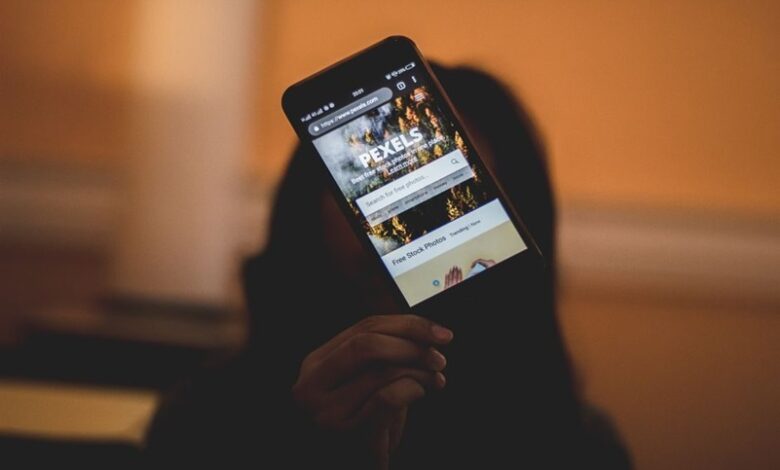
Person holding a smartphone and scrolling through a website
Small tap targets are an easy problem to miss and fix
Apple’s and Google’s own accessibility guidance both converge on roughly 44 to 48 pixels as the minimum comfortable size for something a thumb needs to tap accurately. Google’s own developer documentation on accessible tap targets sets this out clearly, along with the spacing needed around each one so adjacent links do not catch a mistaken tap.
A menu link that is technically present but too small or too close to its neighbours to tap reliably is functionally broken, even though nothing in the code is throwing an error.
This is one of the most common causes of “the menu doesn’t work” complaints that turn out, on inspection, to be a menu that works fine but was built for a mouse pointer with pixel-level precision rather than a fingertip. Widening the tap area, even without changing how the link looks, often resolves it without a full redesign.
Desktop browser testing does not catch mobile problems
Resizing a desktop browser window down to phone width feels like mobile testing, but it is not the same thing. It does not reproduce touch input, does not reproduce the way real phones handle scroll momentum or fixed headers, and does not reveal how a menu behaves when the keyboard pops up or the browser’s own address bar hides and reveals itself. The World Wide Web Consortium’s guidance on writing for accessibility makes a similar point about relying on assumptions rather than direct testing across the range of devices people actually use.
A short list of practical checks before launch catches most of what a resized browser window will not:
- Open the live staging site on at least one real Android phone and one real iPhone, not a simulator.
- Tap every navigation link with a thumb, at a normal one-handed grip angle, not a careful fingertip.
- Check the menu closes properly after a link is tapped, and that the close control itself is reachable and large enough.
- Scroll the page with the menu open to confirm it does not trap the scroll or leave content hidden behind it.
- Test with the phone’s accessibility text-size setting increased, since a menu that fits at default size can overflow badly at a larger one.
Close-up of a person holding a white smartphone
A broken mobile menu is also a search ranking problem
Beyond the immediate frustration of a visitor who cannot find the page they need, a broken mobile menu carries a search consequence too. Google’s own documentation on mobile-first indexing confirms that the mobile version of a page, not the desktop one, is what Google predominantly uses to crawl and rank a site. If the mobile menu buries or hides key pages that the desktop menu surfaces clearly, that structural difference can genuinely affect how well those pages are found and ranked, independent of the content on them.
This is one of the reasons a website redesign benefits from a proper technical review once it launches, checking that navigation, internal linking and page structure survived the move to the new design intact rather than assuming a fresh coat of paint carried everything over correctly. Smashing Magazine’s coverage of mobile navigation patterns makes a similar case: navigation is a structural decision with real consequences, not a cosmetic one to finalise last.
Close-up of a hand tapping a smartphone touchscreen
Small businesses commissioning a redesign rarely have the time to audit tap targets and mobile crawl behaviour themselves once the site goes live. This is exactly the kind of post-launch check pomegranate, a UK agency named DesignRush’s 2025 Top SEO Company, folds into its web design work, confirming a new site actually functions the way it looks like it should on the device most visitors are using.
Frequently Asked Questions
Why does my new website’s menu not work on mobile?
Most often the mobile menu was designed as an afterthought to a desktop layout rather than planned on its own terms, resulting in tap targets that are too small or too close together, or a panel that fails to open or close cleanly on a touchscreen.
What size should mobile menu links be?
Roughly 44 to 48 pixels square is the widely used minimum for a comfortably tappable link, based on guidance from major accessibility standards. Anything smaller increases the chance of a visitor missing the link or tapping the wrong one.
Is testing in a resized desktop browser enough to catch mobile navigation problems?
No. A resized browser window does not reproduce real touch input, scroll behaviour or how the address bar and keyboard interact with a fixed menu, so problems that only appear on an actual phone can pass unnoticed in a desktop test.
Does a broken mobile menu affect search rankings?
It can. Google predominantly indexes and ranks the mobile version of a page, so if the mobile menu hides or buries pages the desktop version surfaces clearly, that can affect how well those pages are found in search, separate from the content itself.
What is the quickest way to check if a redesign broke mobile navigation?
Open the live site on a real phone, tap through every navigation link one-handed, and confirm the menu opens and closes cleanly and does not trap scrolling. This catches the majority of issues a desktop-only review misses.
Sources


